Everyone loves a good offer, right? I know I do. I’ll bet you do, too. Your potential customers are no different. In this post I talk about seven types of offers to include in your online store, and how to write captivating copy about them.
Offer 1: Free shipping
Shipping charges are super annoying. Have you ever got a great deal online, only to find that with the shipping costs, you’d have been better off going to a store? Free shipping, especially on large items, is a huge incentive for your customer to click ‘add to shopping cart’. Need proof? Check this out.
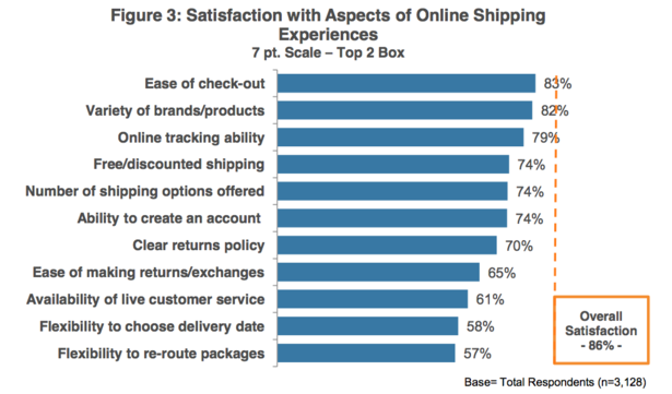
This graph from Econsultancy shows that free or discounted shipping offers a great deal of customer satisfaction. 74% of respondents say that free or discounted shopping is part of a satisfying online shopping experience. Unfortunately if you’re coy about offering this service, you’ll miss out on the benefits of this conversion tool. Display the fact you offer free shipping prominently on your page. Like this.
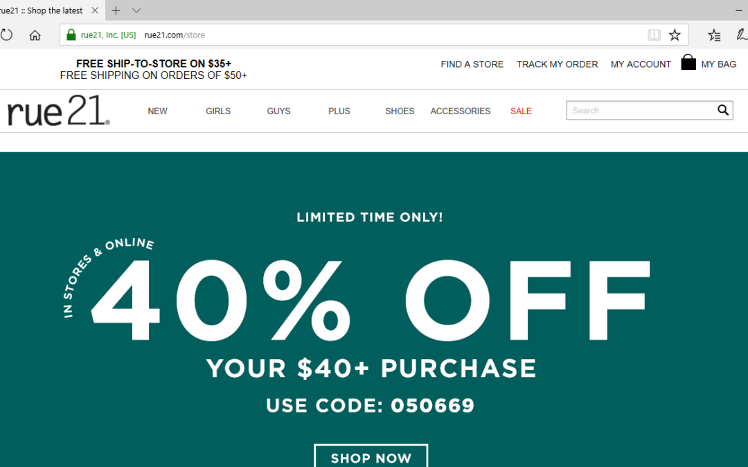
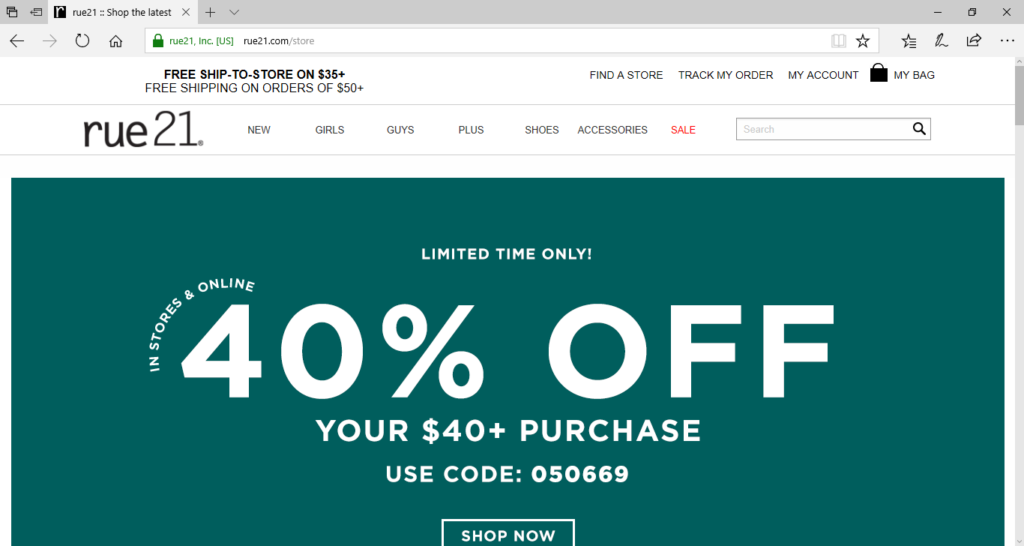
They clearly explain their free shipping policy, right above their logo. The bold font draws the eye and makes sure you see it. Because the header stays the same whichever page you’re on, including on product pages like this one, you can see the message of ‘free delivery’, wherever you are on the site. This is good.
Offer 2: Buy one get one free
Because this is likely to be a limited time offer (unless you’re crazy generous and have margin to throw away), really shout about it. Don’t do it like this site.
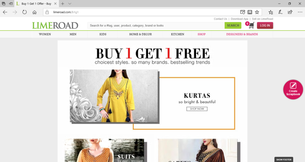
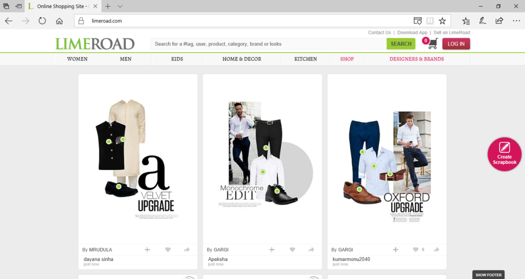
Limeroad is a fashion site. Here’s a page all about their buy 1 get 1 free offer. Looks all good, right? Well, it would be good if this was the landing page you get when you hit Limeroad.com. But no.
This is what you get. The buy one get one free offer is nowhere to be seen. Nowhere. I stumbled across the former page by accident. I doubt most visitors to the site even know it’s there, so the promotion won’t drive sales, which, of course, is the whole point. If you use a “buy one get one free offer”, make it prominent on your home page.
Offer 3: 50% off
Obviously this is the same as a buy one get one free – it’s going to be for a limited time. So plaster it all over your homepage for maximum effect.
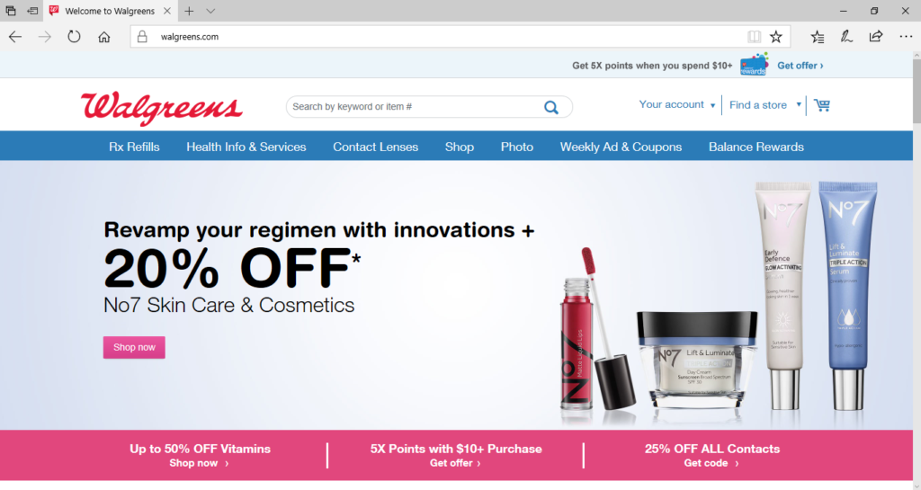
Walgreens have it right. All kinds of percentages off different products. The first thing you see when you land on their website. This is great.
Offer 4: Store card discounts
This is along the lines of, “get one of our store credit cards, and get 15% off your next purchase.”
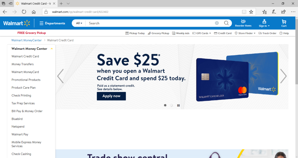
Walmart are smashing this right now. This is what pops up if you go to the Walmart Money Center. But even more impressive is their homepage. Not only do they have a banner touting this offer, they have two banners. You can’t get much better than that. The only disappointment is that the banner doesn’t stick when you go onto a product page. If you offer something like this, include it in the header throughout all your product pages for maximum visibility.
Offer 5: Financing
Buy now, pay later. That’s an amazing incentive for customers to click ‘add to cart’.
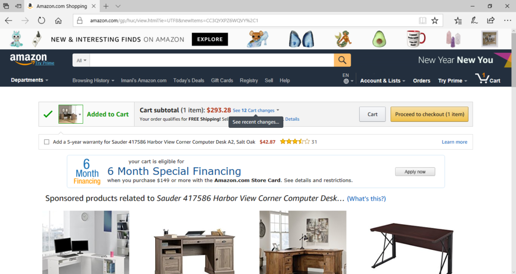
Amazon does this well. Once you’ve added an item to your cart, a financing offer shows up. See it here “your cart is eligible for 6 month special financing”. I don’t know what special means here, but you have to admit it sounds good! You can include finance information on product pages, or after the item is added to cart.
Offer type 6: Order now, get it delivered by…
While this isn’t strictly an offer, it still motivates the customer to make a purchase. Of course, one downside to online ordering is that it takes longer to get your item than if you just go out to the store. Including delivery dates on your product page can be an attractive incentive for them to buy. Unless, of course, it’s going to take months and months!
Offer 7: Discount Codes
Everyone loves a discount code.
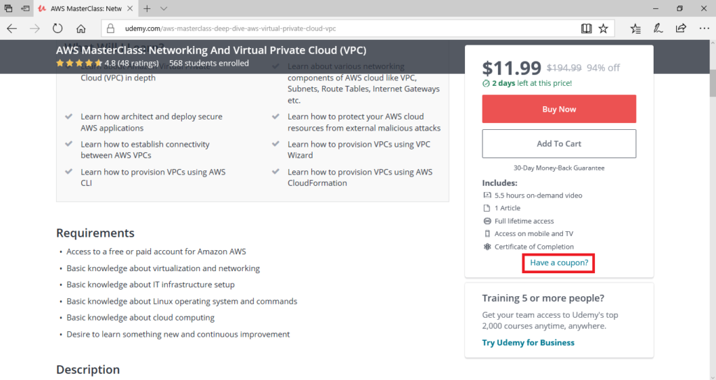
Check out how Udemy incorporates this on their sales pages. Instead of waiting until the cart to show that there are discount codes available, they show them on the product pages. This prompts users to Google “Udemy codes” to see if they can get a discount before they buy. If Udemy had left it until the shopping cart, they may have lost customers looking for a bargain.
Guarantees
Now we’re done with the offers, let’s take a look at guarantees. Guarantees are an effective way to tip customers into a purchase. After all, when we consider buying a product, especially online, we’re concerned with risk. We’re risking punching in our credit card details, without having touched the product or seen it in person. That’s why guarantees work really well in online stores. But to be effective, they have to be written well. Let’s check out a couple of examples.
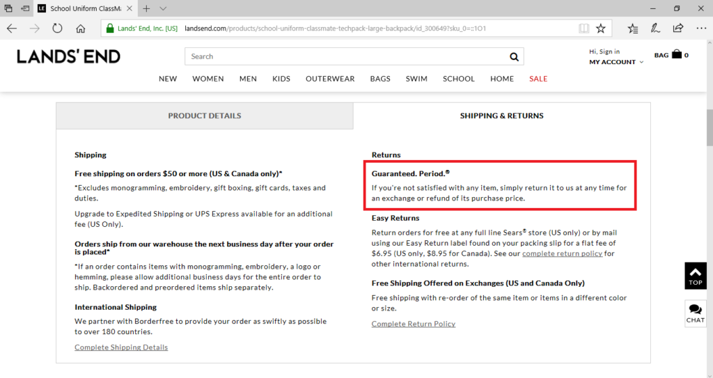
I like this example from Lands End. When on the product page, you click on the Shipping & Returns tab and the first thing you see is their guarantee. “Guaranteed. Period. If you’re not satisfied with any item, simply return it to us at any time for an exchange or refund of its purchase price.” This is simple and effective. I like the “guaranteed. Period” phrase. That makes it sound like they’re a hassle-free place to make returns to. If someone is on the fence about an item, they’re more likely to go ahead and order when they see this guarantee. Sure, they might end up returning it. But they might end up loving it, and become a customer for life. If they didn’t know returns were so easy, maybe they wouldn’t have taken the chance in the first place. This guarantee reduced the risk of the purchase.
When you write guarantee statements, make them reassuring. Focus on making sure the customer is satisfied with what they’ve bought. Sometimes websites use phrases like “if it’s not what you expected”, or “if you’re not satisfied for any reason”. In your guarantee be clear about how, when and why you offer refunds and accept returns.
The main things you need to get across in the guarantee statement are:
- You care about the customer’s experience – you’re not just out to get their money
- The time frame they have for returns or refunds – two weeks? Two months? Lifetime?
- Why you’ll accept a return and why you won’t – if it’s damaged? If the color doesn’t look the same on their monitor? Make this clear in the guarantee statement to avoid disgruntled customers later on
With all these in place, you’ll write an awesome guarantee statement to tip unsure buyers into willing customers. Place your guarantee near your ‘add to cart’ button for maximum effect.
Which brings me to my final point. Great offers and great guarantees only work online if your potential customers see them. So make sure your web designer is up to date on the latest research about website usability and navigation. Online, what you say is important. But sometimes, “where”you say it is even more important.
Recent Comments