What would you say if I told you that I could put you in a barrel, drop you into the water at the top of Niagara Falls, and your barrel would float upstream? You’d say, “Alan, that’s impossible. Everyone knows that a barrel put into the water at the top of Niagara Falls will go over the falls. That’s the law of gravity. The barrel would go with the flow of the water, over the falls.”
 OK, but what if I showed you this flyer (right) and asked you to read it in a logical way? Would you read it in a logical way? Would your eye start at the top and read this copy in a logical order?
No, it wouldn’t. You’d say, “Alan I can’t read this flyer in a logical order because this flyer doesn’t have any logical order.”
And you’d be correct.
Visually, it has no logical flow. And the copy doesn’t have any logical flow either. Your eye doesn’t know what to look at first. Your brain doesn’t know where to start reading. And your brain doesn’t know how to follow the copywriter’s flow of thought because the copywriter doesn’t have one.
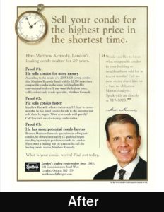
 Now let’s look at that same flyer after a professional copywriter has re-written it (left). This new version of the flyer contains all of the same facts as the first version, except the copywriter has arranged the facts into a logical flow.
Your eye naturally starts at the top, with the headline. The headline speaks to you directly and promises you two benefits: Sell your condo for the highest price in the shortest time.
Your eye naturally drops down to the subhead: “Hire Matthew Kennedy, London’s leading condo realtor for 20 years.”
Then your eye naturally drops down to the body copy, where the sales pitch follows a logical flow. Proof number 1, proof number 2, proof number 3, and so on.
The flyer concludes with a call to action. “What is your condo worth? Find out today.”
When you compare these two flyers side by side, you see immediately that effective copy follows a logical order. It promises a benefit, gives reasons to believe that benefit, and then asks for the order.
As you can see, the revised version of the flyer makes two major improvements. It puts the copy points into a logical order, and it arranges the ad visually into a logical order.
The designer’s job is to make your copy work visually. But your job is to make the copy flow logically.
When you make your copy easy to follow, something else follows easily: sales.

Recent Comments