Too many lead magnet landing pages make one fatal mistake – they don’t describe exactly what the lead magnet is.
You want your lead magnet landing page to be very specific, and that includes an explanation of exactly what you’re offering. This could be included in the headline, in the subhead, or in body text, or a mixture of these.
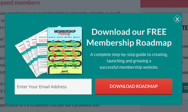
Check out this example from Digital Current. The headline explains what the lead magnet is ‘download a free membership roadmap’. But the writers of this landing page knew that was not specific enough to hook most people. The question readers would be asking is ‘what on earth is a membership roadmap?’ Wisely, they follow this question up in the subhead, ‘a complete step-by-step guide to creating, launching and growing a successful membership website’. By the time we’ve read the headline and the subhead, we’re very clear about exactly what we’re getting.
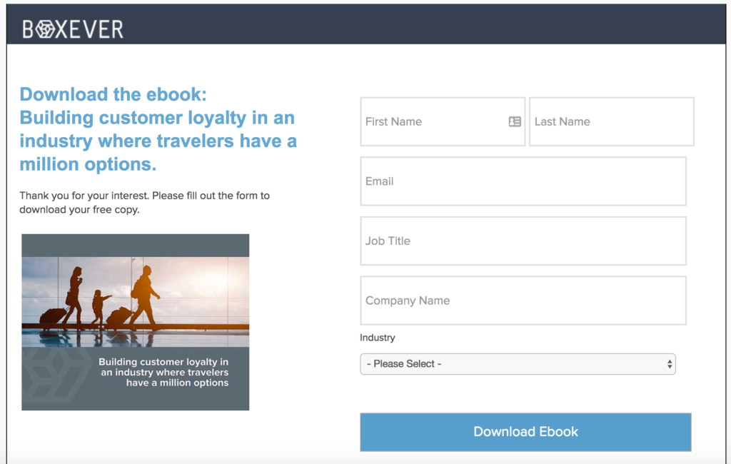
Here’s another example, from Boxever. The headline very clearly explains what the lead will receive when they enter their details – an ebook about building customer loyalty in an industry where travellers have a million options. This is good. But I think the subhead leaves a lot to be desired. ‘Thank you for your interest. Please fill out the form to download your free copy’. This space could have been used to describe more about the lead magnet and focus on benefits. For example, they could have said ‘a step-by-step guide on how to bring customers back again and again’, or ‘7 things your business should be doing to build long term relationships with customers’.
Though they explained clearly what they were delivering – an ebook on building loyalty, they didn’t give a peek into their method, whether that be steps to follow, things to implement in the business, or tips and tricks. This makes their offering feel less specific, and therefore less desirable.
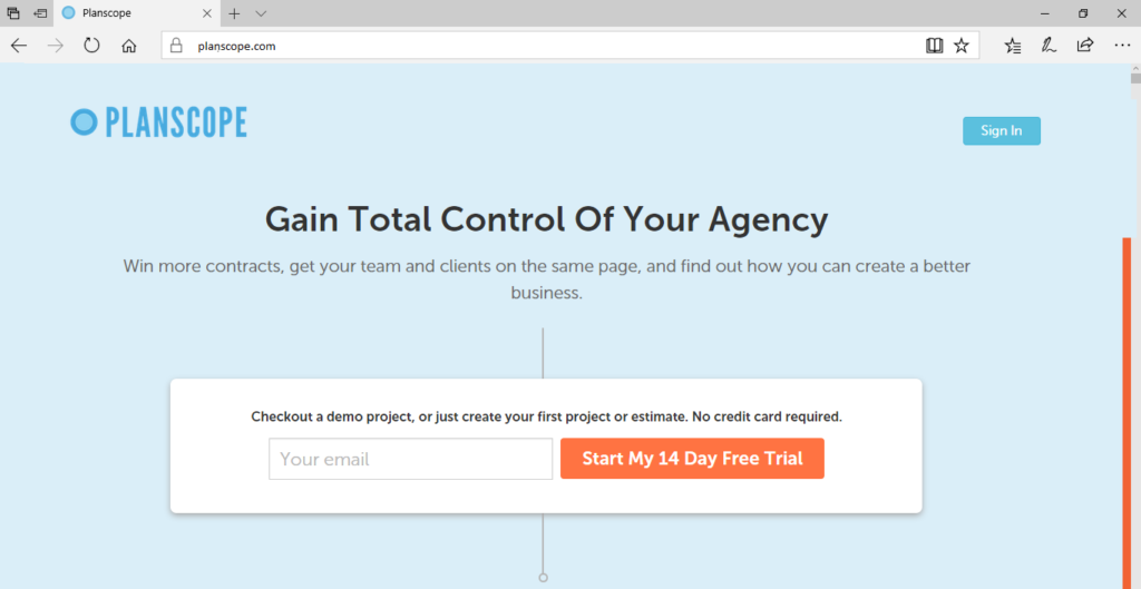
Here’s another example. This is a great landing page in many ways, because the heading, the subhead and the text above the sign up box are all very benefit-oriented. ‘Gain total control over your agency’ appeals to the leads’ desire. ‘Win more contracts, get your team and clients on the same page, and find out how you can create a better business’ are all great benefits, too. But when it comes to detail on exactly what Planscope is, this landing page falls short. ‘Checkout a demo project, or just create your first project or estimate’ are not really compelling enough. We still don’t know exactly what Planscope actually does. We know how it benefits us. But what are the features?
They could have easily added a series of bullets to explain their benefits, such as:
- Increase your closing rate with new clients (and save time wasted on creating estimates) by using our innovative ‘Collaborative Estimates’ tool.
- Create invoices and bills on your terms – daily, weekly, monthly, annually
- Forget email, phone, Skype and more. Communicate with your clients and team in one place.
Listing these features would show leads exactly what they’re getting. This would make signing up feel like less of a gamble with their time.
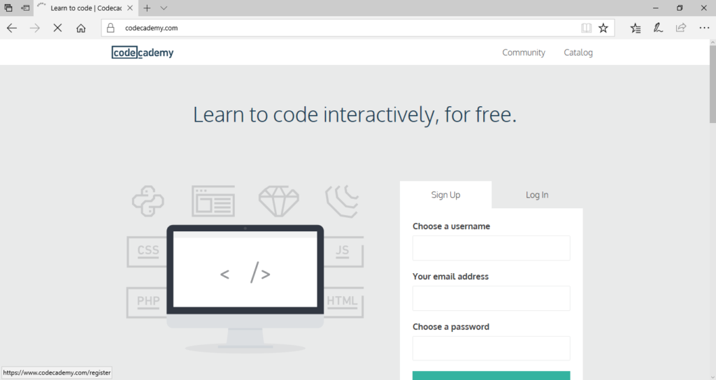
Here’s the landing page for Codecademy. The headline ‘Learn how to code interactively, for free’ is obviously very compelling for people who want to learn how to code. I think they could have gone a step further with something like ‘over 100 videos to choose from, to teach you all aspects of coding step-by-step’. Showing leads exactly what they’d get if they type in their email could help to tip some over from being unsure, to being eager to sign up.
So we’ve looked at a few examples of how we must be specific not only about the benefits a lead magnet will give the user, but also how those benefits are delivered. Now, some landing pages have the opposite problem. They explain exactly how the benefits are delivered, which is great. What’s not so great is that they don’t phrase this in benefit-driven language.
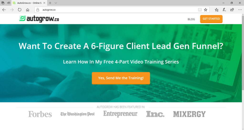
Look at this landing page from Autogrow. Right away, the headline tells us what the lead magnet is ‘a 6-figure client lead gen funnel’ and the subhead explains the format ‘a free four part video training series’. But in my view there’s something not quite right about this. For one thing, ‘6-figure client lead gen funnel’ is quite a mouthful. You have to read or hear that a couple times to get your head around it. It’s not written in benefit-driven language, is it?
If it were, it might read something like: ‘do you want to know how to find and convert 6-figure clients?’ Then the subheading could be ‘in this free four part video training, we’ll create a sales funnel to snag 6-figure client leads’, or something similar. This puts the benefits back at the forefront – finding and converting clients, and snagging client leads. This makes the lead magnet offer much more attractive.
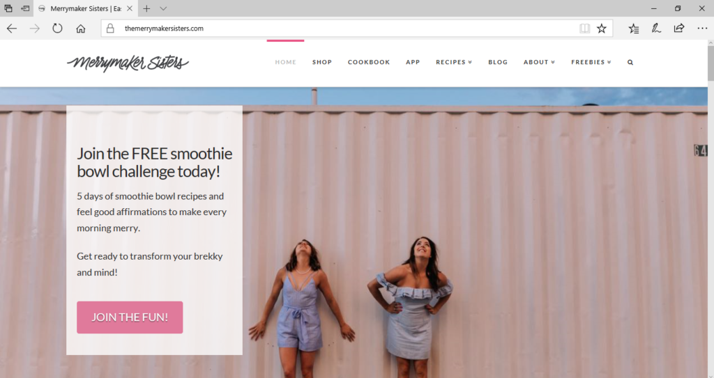
Let’s look at one more example before we wrap up. This is a great example from the Merrymaker Sisters. Join the free smoothie bowl challenge today. 5 days of smoothie bowl recipes and feel good affirmations to make every morning merry. Get ready to transform your brekky and mind! They’ve covered both bases here. On the one hand, they mention explicitly exactly what the lead magnet includes. In this case, 5 days of smoothie bowl recipes and feel good affirmations. On the other, they’ve very clearly stated the benefits. ‘Make every morning merry, and transform your breakfast and your mind’. They’re very clear on the benefits they’re delivering and how they are going to deliver them – through smoothie recipes, in this case!
I think the main message should be clear now. But let’s recap one more time.
- Somewhere in your landing page, you need to let your leads know the benefits they’re getting from the lead magnet
- The way the benefits are delivered needs to be made clear, too. Is it an email series of tips? An eBook of 26 strategies? Daily texts? Whatever it is, it should be clear to your leads.
Whether you’re offering serious tech or smoothie recipes, I hope you’ll feel more confident about making your lead magnet enticing.
Recent Comments